
Optimise your Shopify cart: Inside the IDEAL drawer
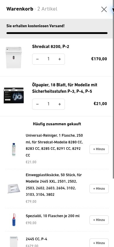
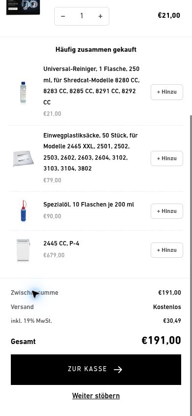
A shopper has added a product. Now they want to check their selection, perhaps add something and understand the order total. At IDEAL, we reworked that journey with a custom Ajax drawer. The cart opens within the store while the product page remains behind it.
Cart pages and drawers handle the same task differently
A traditional cart page opens a separate page for the order. It offers space and can work well for large baskets. A drawer overlays the current page. Shoppers who want to keep browsing can close it and return to the same place.
Shopify themes can offer different cart types. Switching to a drawer alone doesn't improve a purchase journey. What matters is how clearly it handles the selection, changes, costs and next step.
In the IDEAL project, we continued developing this area after the Shopify relaunch. The screenshot comes from the store and shows the drawer with two items and the order summary.
1. Check and change the selection
The image and product name should make each item recognisable. At IDEAL, quantity controls and price sit beside the item. Shoppers don't need to return to the product page to change them.
Try long product names, several items and an unavailable quantity. After a change, the item count, prices and total must agree. A second click during a pending request shouldn't silently create an unintended order state.
2. Keep shipping and total together
IDEAL shows shipping status above the items. The summary groups subtotal, shipping, included VAT and total beside the checkout action. The cost information is available where the customer decides to continue.
A shipping progress bar needs rules that match the country, discount and basket value. Only display free shipping when it applies to the current situation. Check what happens when removing an item takes the basket below a threshold.
3. Add recommendations without leaving the cart
The drawer has an area for additional products. A shopper can add a suggestion directly, then continue editing the order. Checkout remains in the summary area.
Choose recommendations around the product and the customer's task. For accessories, compatibility matters. A popular item isn't automatically a useful addition. Also check whether recommendations still fit after cart changes and whether they're available.
4. Review the full journey on a phone
Open the drawer from a product page and use each action. Are the quantity controls easy to reach? Can you scroll through a longer list without losing checkout? Does closing and reopening the cart preserve the selection?
Keyboard and screen-reader checks belong here too. Focus should move into the dialog and return to its trigger when closed. Errors need understandable text, and buying shouldn't depend on an animation.
Cart acceptance checklist
- Add an item, change its quantity and remove it.
- Keep two variants of the same product distinct.
- Check discounts, shipping and total against checkout.
- Handle unavailable quantities and interrupted requests clearly.
- Add a recommendation and check the updated order.
- Test the empty state, long names, phone, tablet and keyboard use.
Shopify provides the Ajax Cart API for implementation. Test both the request and the updated interface. Customers should always be able to tell whether their change was applied.
What to review after the rebuild
Look at the journey from cart to checkout and completed order. Basket value, purchased items and revenue per visitor help assess the result. Recommendations should contribute to the order without making it harder to finish. With suitable data, an A/B test can compare variants.
The complete ahead Ajax cart revamp offers another example. For your own cart, see Shopify CRO and Shopify development.