
MECLABS: How I review a Shopify purchase journey
A store can look well organized and still leave important questions unanswered. Why choose this product? Is this variant right for me? What happens after I click? When reviewing a purchase journey, I begin with those unresolved decisions. The MECLABS Conversion Heuristic helps me organize observations and turn general design criticism into a specific hypothesis that can be investigated.
I use it as a thinking tool for CRO. The formula doesn't calculate a conversion rate or promise a sales increase. MECLABS also describes a heuristic as a way to understand a process, rather than an equation to solve. The model organizes questions. Whether a proposed answer helps in your store must still be checked against actual behavior. MECLABS on heuristics
What the formula means
The familiar expression is C = 4m + 3v + 2(i − f) − 2a. Its letters represent conversion, motivation, value proposition, incentive, friction and anxiety. The weights direct attention to these factors. They aren't universal measured coefficients you can apply to arbitrary scores for your pages to calculate a reliable purchase probability. The MECLABS Conversion Heuristic
In practice, I translate the terms into questions about a particular visit. What is the person trying to accomplish? What must they understand? Where do they get held up? Which concern remains before the next action? I examine the page alongside its entry point. Someone arriving through a precise search may need a different introduction from a visitor following a general social advertisement.
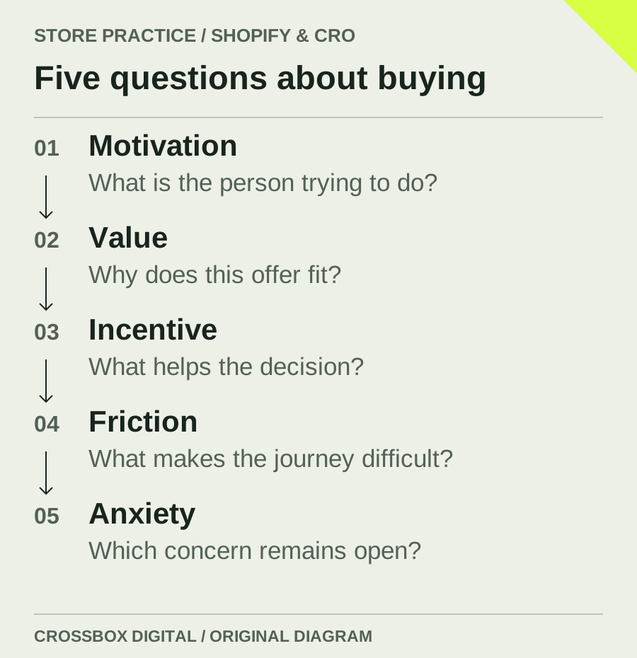
Motivation: What brought the person here?
Consider an illustrative store selling backpacks. One person needs to replace a broken work bag. Another is preparing for a walking trip. They might inspect the same model while looking for different information. For commuting, the laptop compartment and dimensions may matter most. For the trip, the carrying system and equipment may receive more attention. This is a hypothetical review scenario, not a reported client result.
I would begin with entry points and expectations. Which queries bring people to the page? What does the advertisement promise? Which questions reach service before purchase? The task is to understand existing intent. Adding urgency doesn't replace that work. Someone looking for an instruction manual doesn't become a suitable buyer simply because the store displays a countdown.
Value proposition: Why does the offer fit this task?
Product pages often list attributes without explaining their relevance to a decision. “20 litres” provides information, but a person carrying work equipment may also need usable internal measurements and a view inside the compartment. I check which claim can be supported by a photograph, precise detail or understandable comparison. The customer should be able to assess the usefulness of the offer.
I also ask why the person would buy from this particular store. Selection, suitable advice or a specific service may matter if those things are actually offered. General claims about exceptional quality are difficult to evaluate. A precise description is more useful. If an important service has limitations, those belong in the same understandable explanation, where the customer can consider them.
Friction: Where does the task become unnecessary work?
Friction can emerge through small steps. Someone repeatedly switches between images and sizing information. A selection resets after opening a help panel. The cart doesn't make clear whether a quantity change was accepted. These moments can often be observed directly. I follow the journey myself, then examine whether suitable participants encounter similar difficulties when attempting it without guidance.
Fewer elements don't automatically mean less effort. Removing a useful sizing comparison may shorten the page while making the decision harder. The useful question is how much work someone needs to do to continue confidently. Sometimes a different sequence helps. Sometimes the interface needs an understandable response to a selection. Necessary information needs good presentation, rather than blanket removal.
Anxiety: Which concern remains unanswered?
Concerns arise at particular decisions. A jacket shopper may be uncertain about fit. A subscription choice may raise questions about delivery frequency and cancellation. A generic trust symbol rarely answers either. I check whether the relevant explanation is available where the decision occurs. MECLABS treats anxiety as a distinct factor and discusses addressing the specific source of concern. MECLABS on customer anxiety
For a subscription, I would compare the product selection with the cart and checkout. Are price and frequency presented consistently? Does the person understand the order? Clear copy can help explain an offer. Conflicting settings require technical correction. CRO can make valid information more understandable, but better wording cannot turn a factually incorrect statement into an accurate one.
Incentive: What additional reason makes sense?
A discount can be introduced quickly. First, I want to know which obstacle it is meant to address. If someone cannot judge fit, a lower price leaves the underlying question largely open. Appropriate guidance or a relevant service may matter more. Any incentive should follow from the customer's situation and the store's commercial circumstances.
When an incentive is tested, additional purchases may not be enough to assess it. Costs, margin and later effects can matter too. Conditions should be understandable and actually apply. Artificial scarcity doesn't create a dependable customer relationship. In my review, an incentive gets a defined purpose and a measurement question, rather than becoming the automatic response to every weak metric.
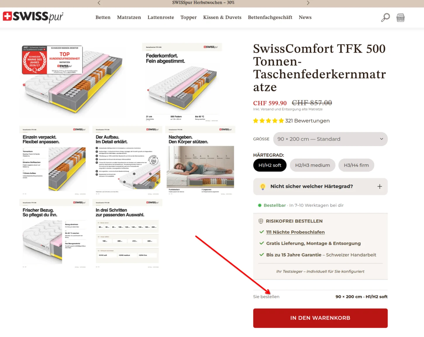
Turn the observation into a hypothesis
I first record the observation, including the page, device and situation where possible. Then I describe a possible explanation. People might search several places for a backpack's dimensions and remain uncertain before selection. A hypothesis could be that visible measurements with a suitable illustration make that decision easier. That states what should change and why the change deserves examination.
Next, I define an observable result. Can people find the dimensions without assistance? Can they explain which model fits their needs? With sufficient data, an experiment can examine commercial outcomes separately. The method should suit the question. A faster button click doesn't establish a better purchase. With low traffic especially, this distinction helps describe progress accurately.
Don't force every finding into one category
An observation may belong to several areas. Unclear sizing can create both extra effort and uncertainty. I wouldn't spend a long meeting arguing about the label. The team needs to understand the problem and agree how to examine it. The heuristic should help organize work. If categorizing an issue takes longer than understanding it, the framework has become a distraction.
I therefore begin with a limited journey, such as the product page through to the cart. Each proposed change gets an assumption and a planned check. A method such as RICE can help discuss the order later. Jobs to Be Done offers another perspective on the customer's situation. These methods answer different questions; combining them into one apparently objective score would blur those distinctions.
Leave the review with decisions someone can act on
The outcome should identify missing information, journeys needing correction, questions to investigate with customers and ideas that remain assumptions. Broad recommendations such as “build trust” or “improve usability” aren't specific enough. Each prioritized task needs a connection to an observed problem and someone responsible for implementation or further investigation.
That's the value of MECLABS in my work: the review stays close to the customer's decision. People can discuss possible causes instead of comparing design preferences alone. The CRO audit explains how this fits a broader store review. When orders are limited, CRO with low traffic describes what can still be investigated usefully.
Common questions about MECLABS
Can the formula calculate my conversion rate?
No. It's a thinking model. The numbers aren't universal measured coefficients for your store. They help organize influential factors. A particular improvement still needs appropriate observation or a properly planned experiment before its effect can be described reliably.
Does the approach work beyond product pages?
The questions can also apply to landing pages, forms and other decisions. You need to understand the particular action and the motivation behind it. Adapt the review to that journey instead of applying an unchanged checklist everywhere and assuming the same answers will fit.
Do I need an A/B testing tool to begin?
Not for the initial review. You can start with a defined journey, customer questions and observations. A later experiment needs suitable instrumentation and enough data. The heuristic doesn't replace those methodological requirements or turn limited evidence into a reliable effect estimate.
Want to review your purchase journey using this approach? In a consultation, we can examine a specific section of your Shopify store, identify the questions customers need to answer and decide which investigation would be a useful next step.